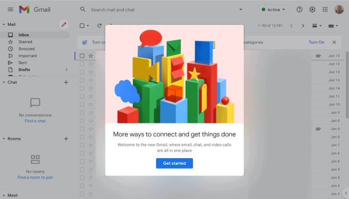
As most Gmail users are probably aware, Google launched a new email platform interface earlier this year. Google did give users the option of reverting to the older UI if they so desired, but it now appears that the company will remove that option beginning this month.
We’ll all just have to get used to the bubbly — and very blue — interface since Google announced it is getting rid of the option to return to the old Gmail UI in a blog post on Tuesday. That includes the Google Sans Text font used in Material Design 3.
The new Gmail design, which has options for Mail, Chat, Spaces, and Meets on the far-left sidebar, is referred to by Google as the “integrated” view. When you click on these buttons, the app takes up the entire screen rather than just appearing as a small pop-out menu when you hover over them.
You can disable Meet and Chat from your Settings menu if the extra buttons bother you. This prevents you from seeing the additional sidebar and instead gives you a screen tailored specifically for Gmail.
Since February, when Google first began testing this layout, it has been nagging users to choose it. In July, the new design became opt-out (which means it swapped you over by default). As with some of the other updates it has already made to its other Workspace apps, such as Docs, Calendar, and Sheets, Google is now prepared to make this change permanent.
As someone who has been using the new layout for quite some time, I can’t imagine going back to the old one. It took some getting used to, but it’s a lot more modern, and once I disable the extra app options, it feels like the old Gmail.


