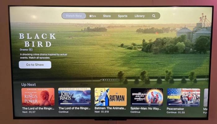
On Apple’s TV app, the “Watch Now” page has been completely redesigned, and there is a huge new banner at the top with auto-playing video and audio and no customizing choices.
When this new design for the TV app’s Watch Now function was first shown off back in November during tvOS 16.2 beta testing, it drew harsh criticism. Interestingly enough, Apple took note of that criticism and changed one thing significantly.
A new “Featured” row was added at the top of the design in the first iteration of the new Watch Now layout in the TV app. This resulted in the “Up Next” row being pushed down, making it necessary for you to scroll down to see your queue.
That “Featured” row is no longer included in the version of the TV app that is currently being sent to Apple TV customers. The “Up Next” queue, on the other hand, keeps its top-level placement for accessibility.
This “Featured” article seems to have been picked by an editorial team. Even worse, you’ll see sizable banners advertising information you’ve already seen. There is no mechanism in place to make the previously seen previews disappear.


